
header sparkles

Mt. Airy CDC

Solving a naming conundrum and building the brand system to grow into

A rebrand and website rebuild that pulled a 45-year-old neighborhood institution out from under the shadow of its own breakout event campaign — and gave it the architecture to grow
project mtairy feat

Project Overview

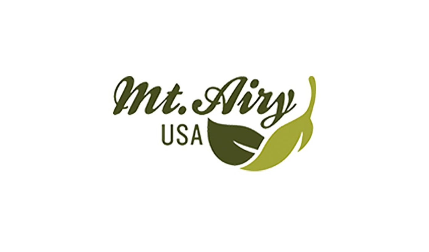
Mt. Airy CDC is the community development corporation serving Mt. Airy, a racially and economically diverse neighborhood in Northwest Philadelphia. The organization has renamed itself twice. Founded in 1980 as Mt. Airy Village Development Corporation, it became Mt. Airy USA in 2000 to project a bigger, bolder identity. By the late 2010s, Mt. Airy USA had a problem most communications teams would envy: one of its programs had become more prominent than the organization itself.

Go Mt. Airy — the events and community engagement campaign launched in 2012 — had built such a strong public following that it overshadowed the parent brand. The two ran on separate websites and separate visual identities, and most of the public didn’t realize they were the same organization. Mt. Airy USA hired Pixel Parlor to fix it.

Visit Site

Dates

2019-Present

Services

360-Degree Branding
Brand Architecture
Naming & Tagline
Visual Identity
Brand Guidelines
UX Strategy
Custom WordPress Development
Website Maintenance & Support

The Challenge

“Mt. Airy USA” had two problems by 2018. The first was identity: the “USA” suffix felt dated and politically charged, and the name kept getting confused with Mt. Airy, NC and the Mount Airy Casino. The second was perception: the public had come to associate Mt. Airy USA almost exclusively with its first-time homebuyer workshops, which obscured the housing counseling, small business support, real estate development, and youth programs that filled out the rest of its work.

Meanwhile Go Mt. Airy was eating the parent brand’s lunch. The sub-brand had clear equity through its business association, events, social presence, and the visible street banners along Germantown Avenue. The parent brand had equity too — with housing clients, with politicians, with the City — but the two ran on parallel tracks instead of supporting each other.

The Goal: Resolve the naming conundrum and build a brand architecture and digital home strong enough to carry the organization through its next chapter of growth.

Our Approach

We treated this as a sequence, not a set of parallel tracks. You can’t design collateral for a brand that doesn’t have a name yet, and you can’t build a website for a brand whose hierarchy hasn’t been resolved.

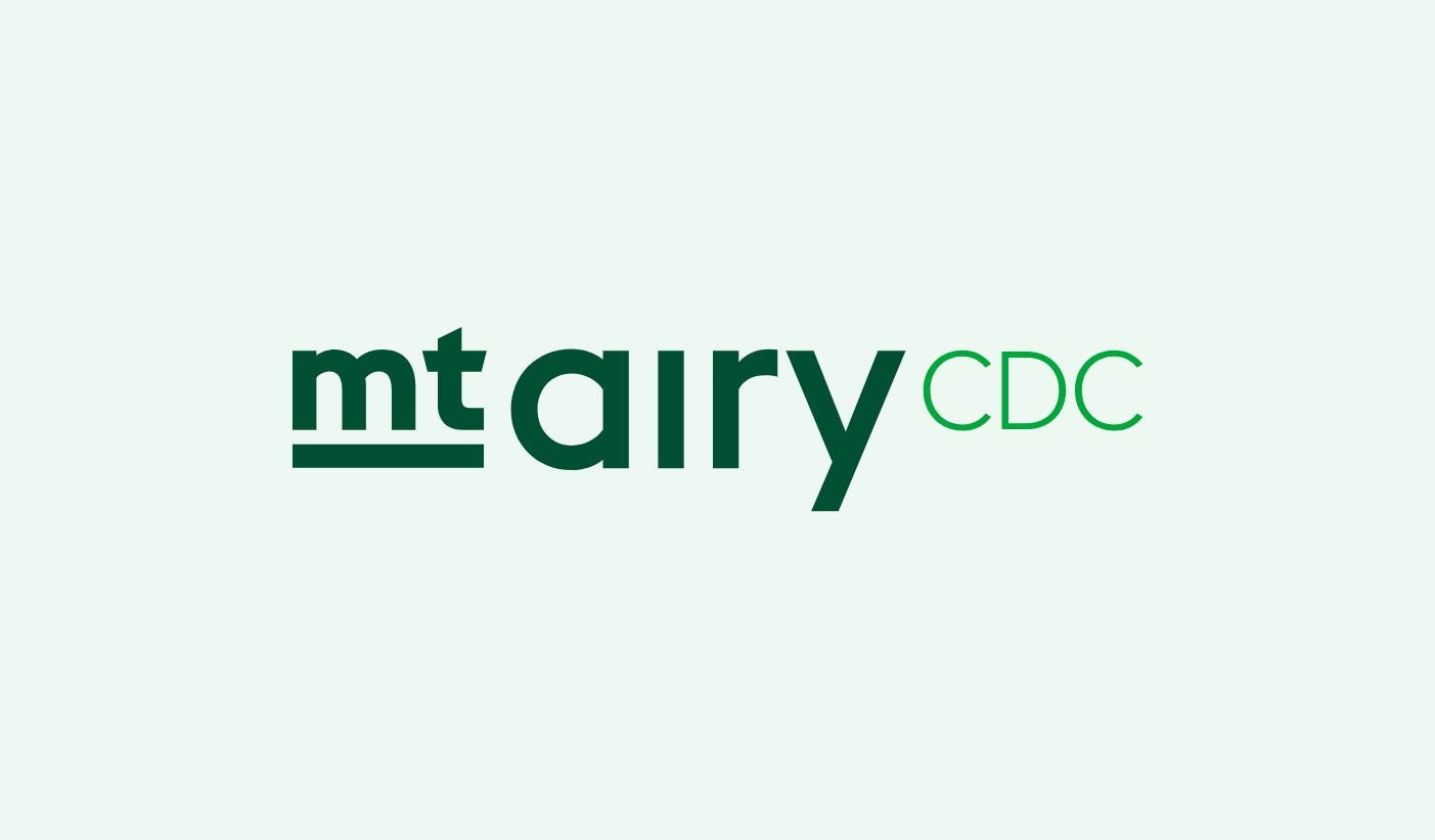
Phase one was the naming and brand architecture work. We facilitated stakeholder workshops to surface what Mt. Airy USA actually did and what name would carry that work clearly. The answer landed where the work landed: Mt. Airy CDC — straightforwardly descriptive, immediately recognizable, and easy to sit alongside Go Mt. Airy and other sub-initiatives without competing with them.

Phase two was the visual identity system: a new logo for Mt. Airy CDC, a refreshed treatment for Go Mt. Airy as a clearly-marked sub-brand, additional sub-brand logos, and brand guidelines so the in-house team could extend the system without recreating it from scratch.

Phase three applied the new brand to the website. The old Mt. Airy USA site was internally focused — operationally functional but not built to celebrate the neighborhood or pull in anyone outside it. We rebuilt mtairycdc.org to flip that orientation: outward-facing, editorial, and architected so all four program areas had a clear home instead of homeownership workshops absorbing all the oxygen.


What We Built

A new name and brand architecture. Mt. Airy CDC as the parent, with Go Mt. Airy and other initiatives clearly nested as sub-brands. The brand standards locked the fix in at the rule level: the Mt. Airy CDC logo must appear with the Go Mt. Airy lockup at all times. After years of the sub-brand running ahead of the parent, the system enforces the relationship instead of leaving it to chance.

A unified visual identity system. A new Mt. Airy CDC logo, sub-brand logos including the refreshed Go Mt. Airy mark, defined typefaces, a four-season color system built around evergreen and spring green, and brand guidelines positioning the organization as adaptable, expandable, and approachable. Modular by design, so the in-house team could extend it without recreating it.

A single consolidated website. Two legacy sites collapsed into one. Built on custom WordPress, the new mtairycdc.org gave every program area a clear home and added significant new functionality: an Events Calendar integration with NeonCRM for Supper Sessions, Moonlight Movies, Autumn on the Avenue, and the rest of the Go Mt. Airy programming; a Go Mt. Airy Business Directory with SEO benefits for members; a job board; a Mt. Airy 2025 Neighborhood Plan section; and a Go Mt. Airy Blog set up to function as an editorial platform.

A foundation for continued work. Mt. Airy CDC kept coming back for additional projects beyond the original scope. We’ve maintained and updated the site since launch, and the brand system has carried the organization through several years of growth.

It’s been a delight to work with Pixel Parlor to solve our organization’s significant branding conundrum… PXP helped us streamline everything with a suite of logos, defined typefaces, and easy-to-use style guides. We’ve enjoyed working with them so much that we’ve enlisted them for projects outside our original scope.

Brad Maule, Former Communications Manager

The Impact

Mt. Airy CDC celebrated its 45th anniversary in 2025 — a milestone that arrived with the brand system and digital home strong enough to carry it. The unified brand and site support an organization that, in 2025 alone:


Looking ahead, the organization is managing $10 million in infrastructure improvements at the Simons Rec campus, preparing to break ground on its first new construction project in over a decade — affordable housing and commercial space on a vacant Germantown Avenue lot — and expanding youth literacy programming with support from the William Penn Foundation. What the rebrand made possible: a single, clearly-named organization that the public can recognize, donors can find, and program participants can navigate. The brand system holds.

Ready to dive in?

Whether you’re launching something new, refreshing an existing brand, or bringing more consistency to your story—we’ll help you do it right from the start.

We’re not just here for deliverables. We’re here for the long haul.

Related Projects