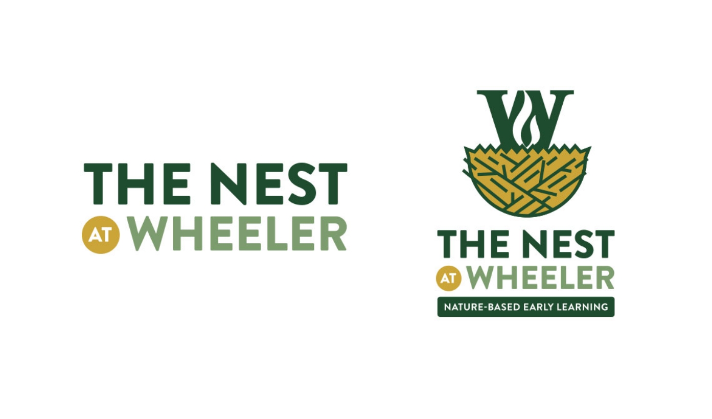
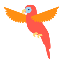
We started with the branding problem, because everything else flows from it. The logo needed warmth and playfulness without being precious — it had to feel like somewhere you would actually want to send your kid, not a corporate childcare chain. We built out brand guidelines alongside the logo so that any future materials, whether digital or print, would stay consistent even as the team evolved.
For the website, we began with sitemap and wireframe work before a single visual decision was made. The goal was to pressure-test the information architecture: could a parent land on the homepage and understand what The Nest is within 10 seconds? Could they get from “interested” to “I know how to apply” without clicking through three submenus? Once the structure was solid, we moved into design and development — building on our custom WordPress camp theme, which meant a faster build, a lower cost, and a foundation the team could manage themselves post-launch.
Print collateral came next, carrying the new brand into physical materials for outreach and enrollment.
What We Built
The Brand Identity
A custom logo and brand guidelines — playful but grounded, adjacent to the Wheeler School’s visual language but distinctly The Nest’s own. Color palette, typography, and usage rules documented for consistency across all future collateral.
The Website
A WordPress site built on the Wild & Wander proprietary camp theme, optimized for mobile navigation, program exploration, and seamless registration. The site presents Nursery and Pre-K programs clearly, surfaces schedule and tuition information quickly, and reflects the warm, nature-infused spirit of the program.
Print Collateral
Outreach and promotional materials built on the new brand system — designed to reach families through direct mail and community partnerships.
Ongoing Support
Post-launch maintenance, content updates, and on-call design support. Seasonal needs, new collateral, website questions — the team has a partner to reach out to.